

Mettle & Silver: Branding To Help Jewelry and Metalsmith Artists Stand Out
Monique, a jewelry artist and metalsmith, came to me for branding help after being referred by a previous client of mine — yesss, word of mouth for the win! Monique, along with her husband Seth, own and operate Mettle & Silver, a hand-fabricated metalsmithing and jewelry business here in New Orleans. Monique and I sat down over coffee and went through her website and Instagram. Since they do not have a brick & mortar shop, the digital realm is the only way her clients and potential customers can access their wares. We looked at some of her favorite jewelry brands and competitors and agreed that a unique logo was essential to help Mettle & Silver stand out.

Stickers that Mettle & Silver were using to adorn their jewelry boxes prior to starting on their new branding project. Screenshot from Mettle & Silver Instagram Story.
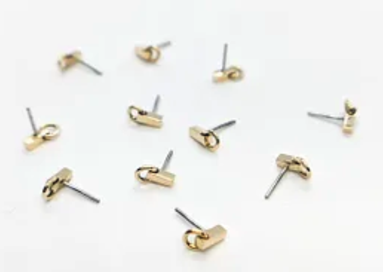
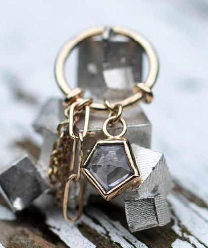
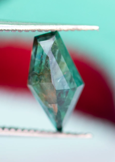
Shown above are some of the unique pieces and multi-faceted gemstones that Mettle & Silver create and work with. It was important to us that the new logo be reflected by their work. Some of the words the client used to describe her work that I wanted to ensure were reflected in their branding were: uniquely-shaped, one-of-a-kind, ‘imperfect’ shapes, and ‘random but purposeful facets.’
Here are some images from the mood board Monique and I created and drew inspiration from. We were both attracted to unique typefaces with high contrast thicks and thins and curvy strokes. Note: All of these images came from Pinterest; I am not the original artist.

The first logo concept that I presented to Monique was based on risograph prints I saw that had bright near-complimentary colors overlaid on top of one another.

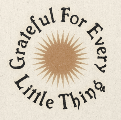
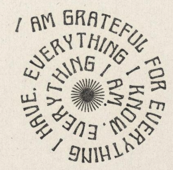
The second concept drew inspiration from vintage handmade stamps on antique goods. My thought was to lean in to Monique & Seth’s handmade techniques as the brand’s unique selling point.

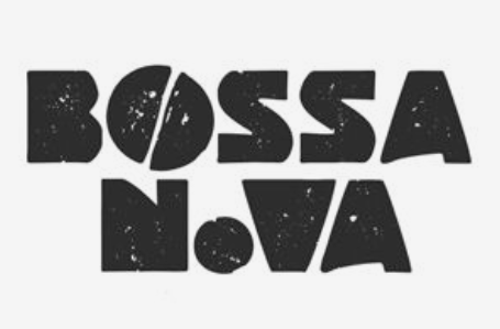
Lastly, a simple wordmark as the unique text-only typographic treatment of the business name to make it identifiable as the brand identity or logo.

Shown here are some of the nearly finished brand elements. Before we finalized some of the logos and submarks shown here, Monique requested that we saturate the colors and go with a bright blue and hot pink — she was totally right!

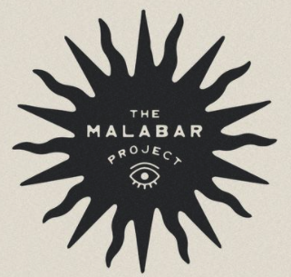
Above are the final pieces of the Mettle & Silver brand package used in proposed photography mockups and the stamp logo shown when and if used as an actual stamp (lower right).

The typefaces chosen for the final logo are Robertson regular and Faune regular.
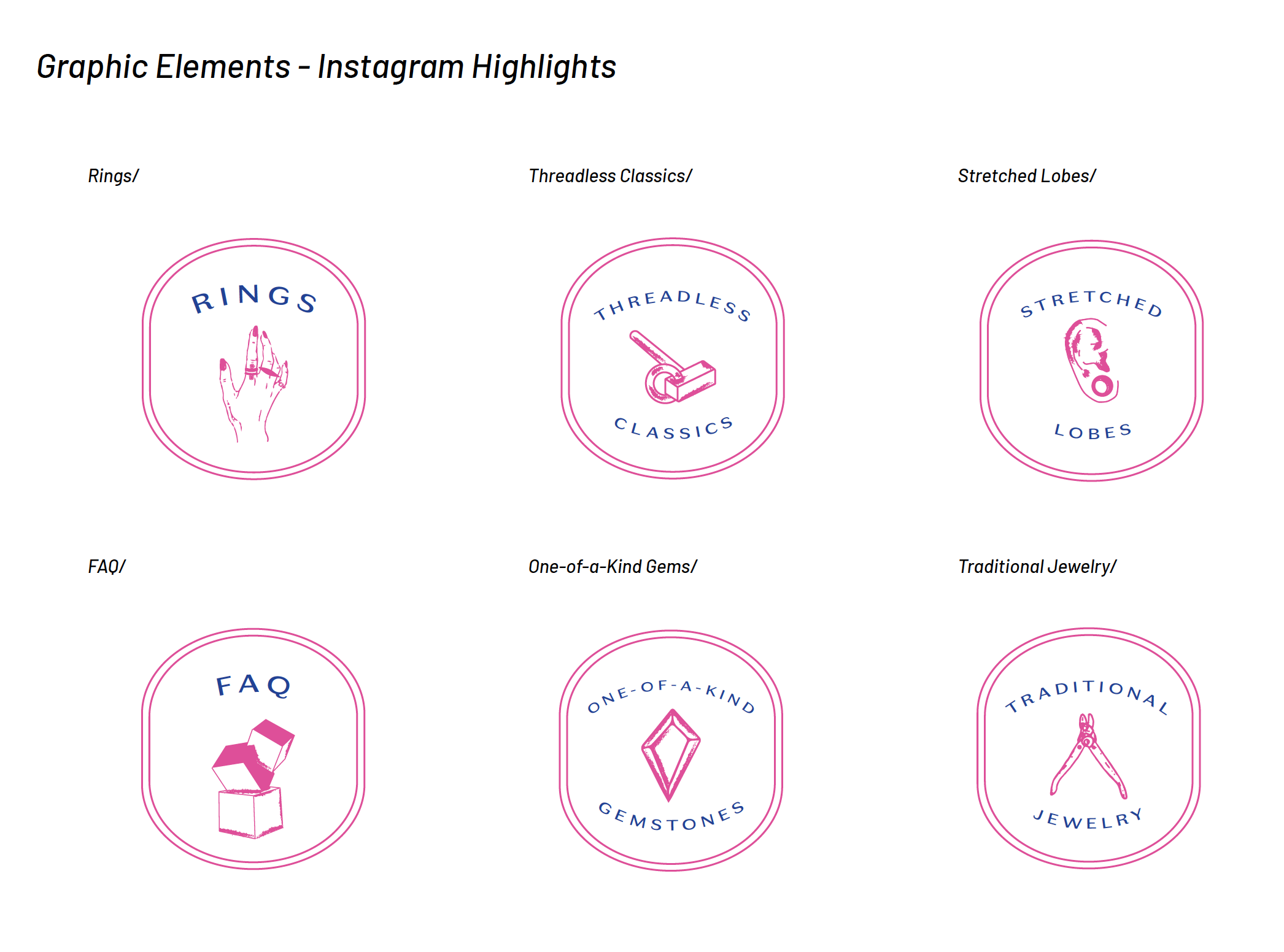
Lastly, the client requested some graphic elements to feature on their Instagram highlights. Each one is a custom illustration!